Databoard Visualizations
📈 Each query element on a databoard renders its saved query using a visualization type. Configure types in the query editor or from the databoard element settings.
📍 Where to configure
- Query editor — primary place to pick visualization and map columns while iterating on SQL.
- Databoard element — edit element opens visualization settings for that widget.
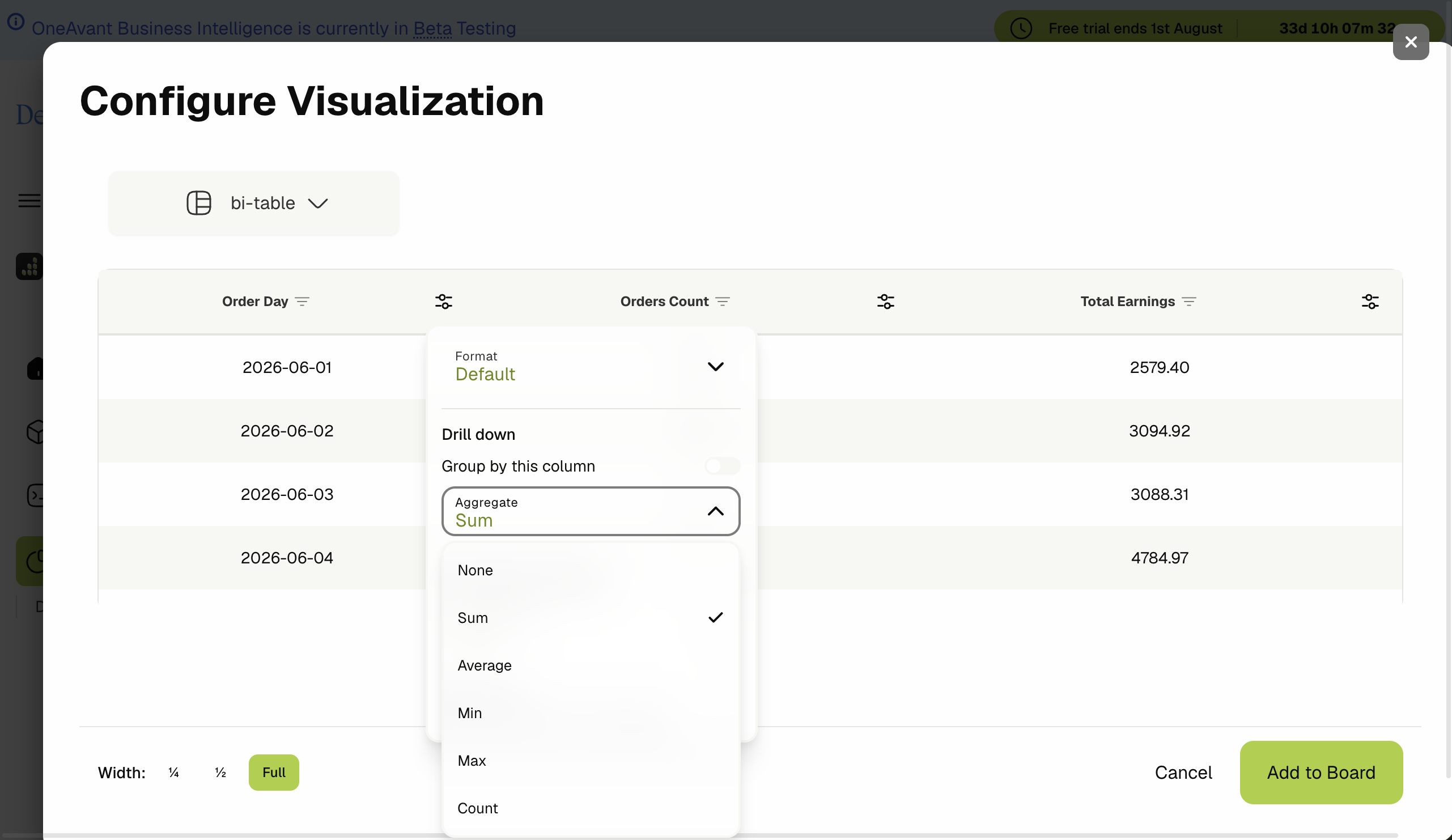
Tables
| Type | Best for |
|---|---|
| Table | Small result sets, all rows visible |
| Paginated table | Large datasets with page navigation |
| BI table | Grouped rows, expandable sections, subtotals, conditional formatting rules |
| Advanced table | Extended table layouts (legacy/advanced options) |
BI table highlights:
- Group by one or more columns.
- Expand/collapse group rows.
- Conditional formatting (color cells by rules).
KPI cards
Card visualizations show a primary metric with optional secondary values, aggregations (sum, count, average, etc.), and formatting.
Use for headline numbers on executive databoards.
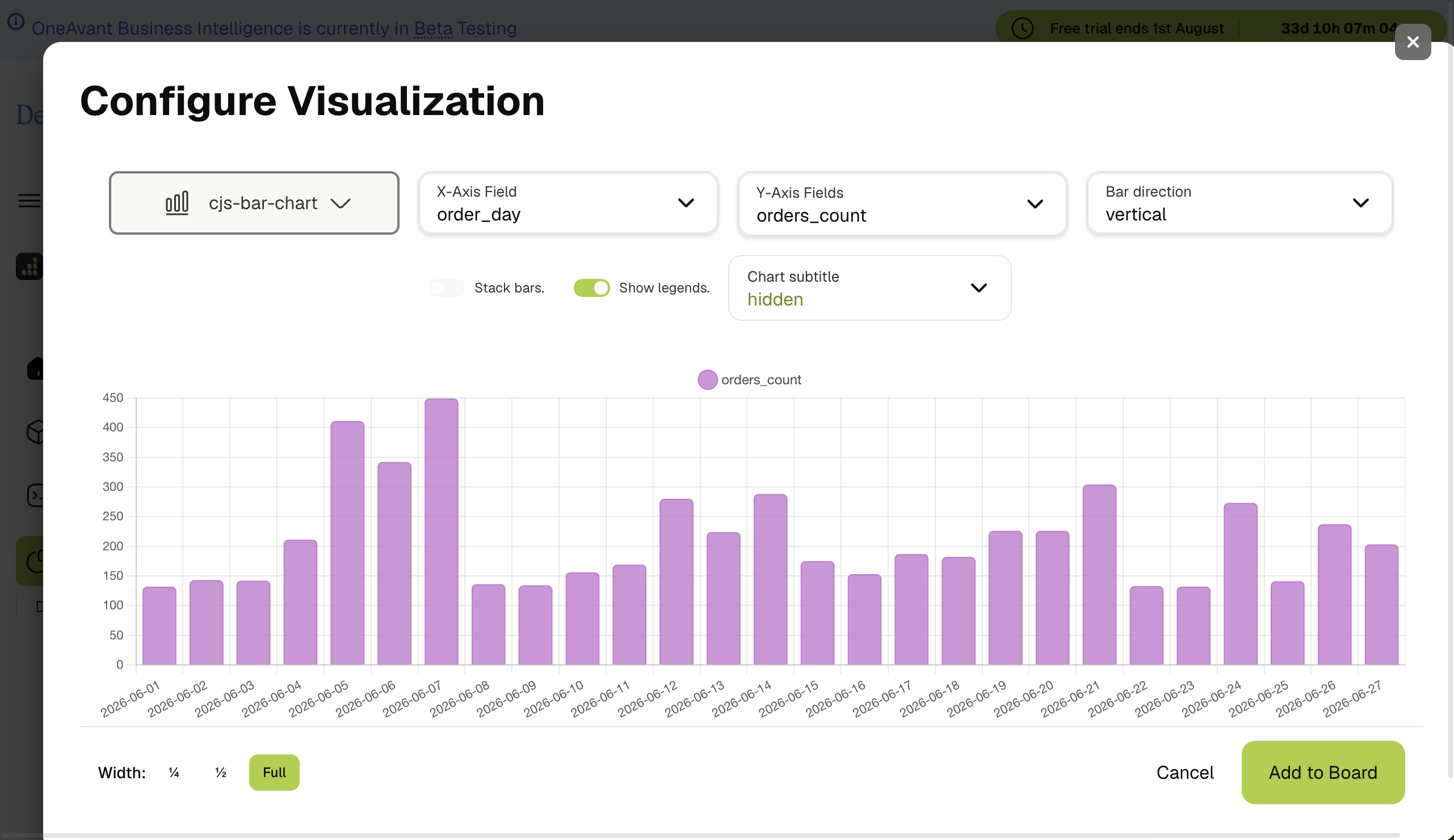
Charts
Legacy chart types:
- Bar, line, pie, ring, date line
Chart.js (recommended) types:
| Type | Use case |
|---|---|
| Line | Trends over time |
| Bar | Category comparison |
| Pie / Doughnut | Part-to-whole |
| Scatter | Correlation |
| Radar / Polar area | Multi-axis comparison |
| Combo | Mixed measure types on one chart |
Common configuration options:
- X / Y axis column mapping.
- Multiple series (multi Y-axis where supported).
- Aggregations per series.
- Chart subtitle (hidden, auto, or custom text).
- Color palette from databoard branding.
Choosing a visualization
🚫 Scope notes
- Visualization options depend on result shape — e.g. charts need at least one dimension and one measure column mapped.
- If a query returns no rows, the widget shows an empty state rather than a broken chart.
- Chart.js types respect databoard palette branding; tables use theme CSS variables.