Areas
🏠 Areas in the IoT Server Dashboard are the logical and physical spaces that organize controls and sub-spaces — for example a property, a floor, a guest room, or a single bathroom. Use this page to build the area tree, link areas to Area Templates, attach controls, and reorder how controls appear inside each space.
📍 Accessing Areas
This page requires an account with the Admin, Engineer, or Operator management role.
- Log in to the IoT Server Dashboard with your management credentials.
- Open Controls & Areas in the left sidebar.
- Click Areas to open the areas list.
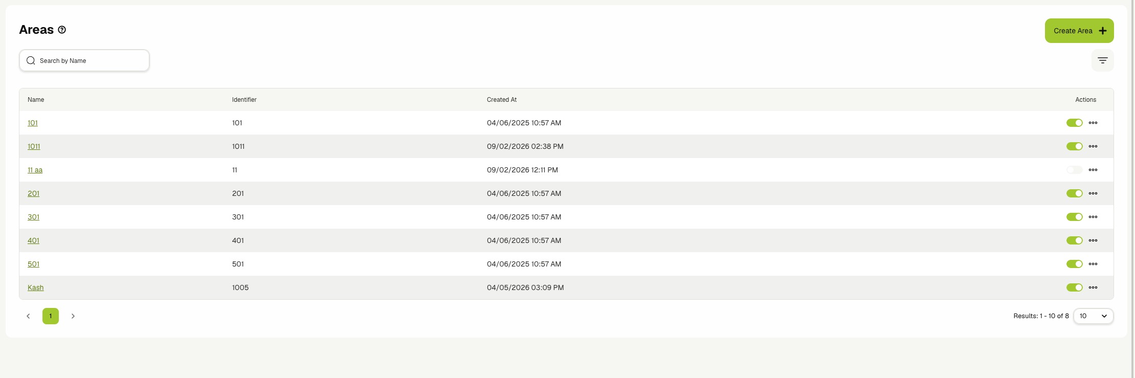
📋 Viewing Areas
The Areas page shows one row per root area. Sub-areas are not listed here — open a root area's details page to navigate its sub-tree.
Use the view toggle in the toolbar to switch between List and Cards.
The list view shows the following columns:
- Name — The area name. Click the name to open the area details page.
- Identifier — The unique stable identifier used by integrations and guest-facing APIs to look up the area. Root areas always have an identifier; sub-areas may leave it blank.
- Created At — Hidden by default. Enable it from the column settings to display the row creation timestamp.
Each row also exposes the Enabled toggle in the actions column.
The card view shows the same root areas as tiles. Each card includes the area name, the identifier (when set), the enabled state, and a quick Edit button.
🔍 Searching and Pagination
- Enter text in Search by Name to narrow the list to matching root areas.
- Use the pagination controls to move between pages and to change the rows-per-page value.
Search only matches against root area names. Use the Tree View on an area's details page to scan sub-area names visually.
➕ Creating a Root Area
- Click Create Area on the list toolbar.
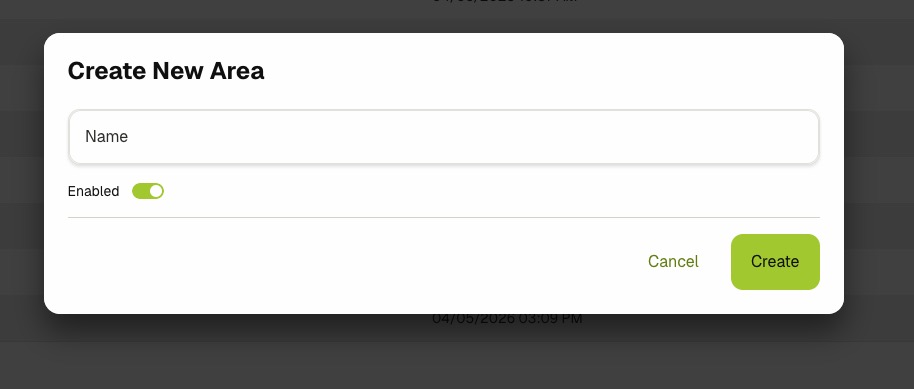
- Fill in the form:
- Name — A human-readable name for the area (e.g.
Penthouse Suite). - Enabled — Toggle the area on or off at creation time. Leave Enabled on unless you are staging the area before go-live.
- Name — A human-readable name for the area (e.g.
- Click Create.
- The new area appears in the Areas list and opens for further configuration when clicked.
The Create Area dialog only collects the minimum required fields. Open the new area's details page and click Edit to set the Identifier, attach a Base Template, add Localizations, and supply Metadata.
➕ Creating a Sub Area
Sub-areas are always created from inside an existing parent area.
- Open the parent area's details page.
- Click Add Sub Area in the header actions.
- Fill in the Name and toggle Enabled as needed.
- Click Create.
- The new sub-area appears under Sub Areas on the parent's details page. Click it to drill down further.
The parent is set automatically from the page you launched the dialog on. To move a sub-area to a different parent later, open the sub-area, switch to edit mode, and reassign its parent through the area picker.
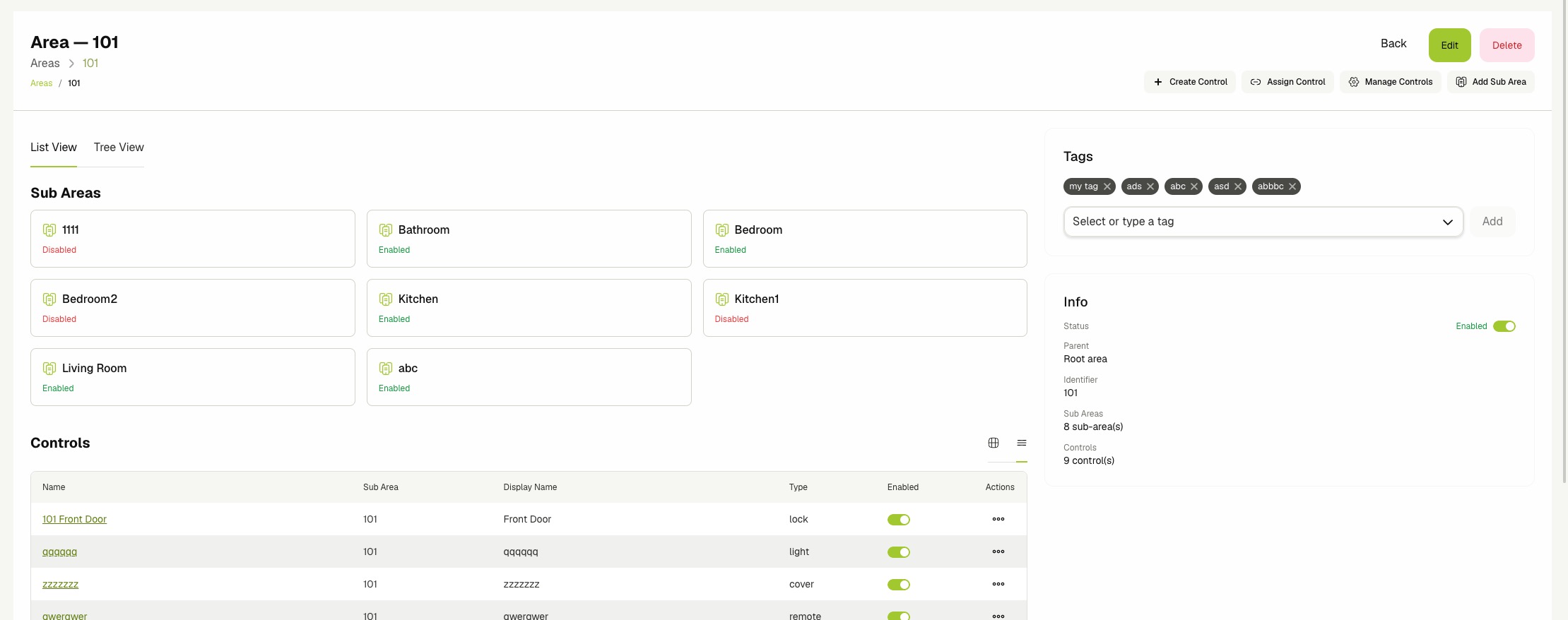
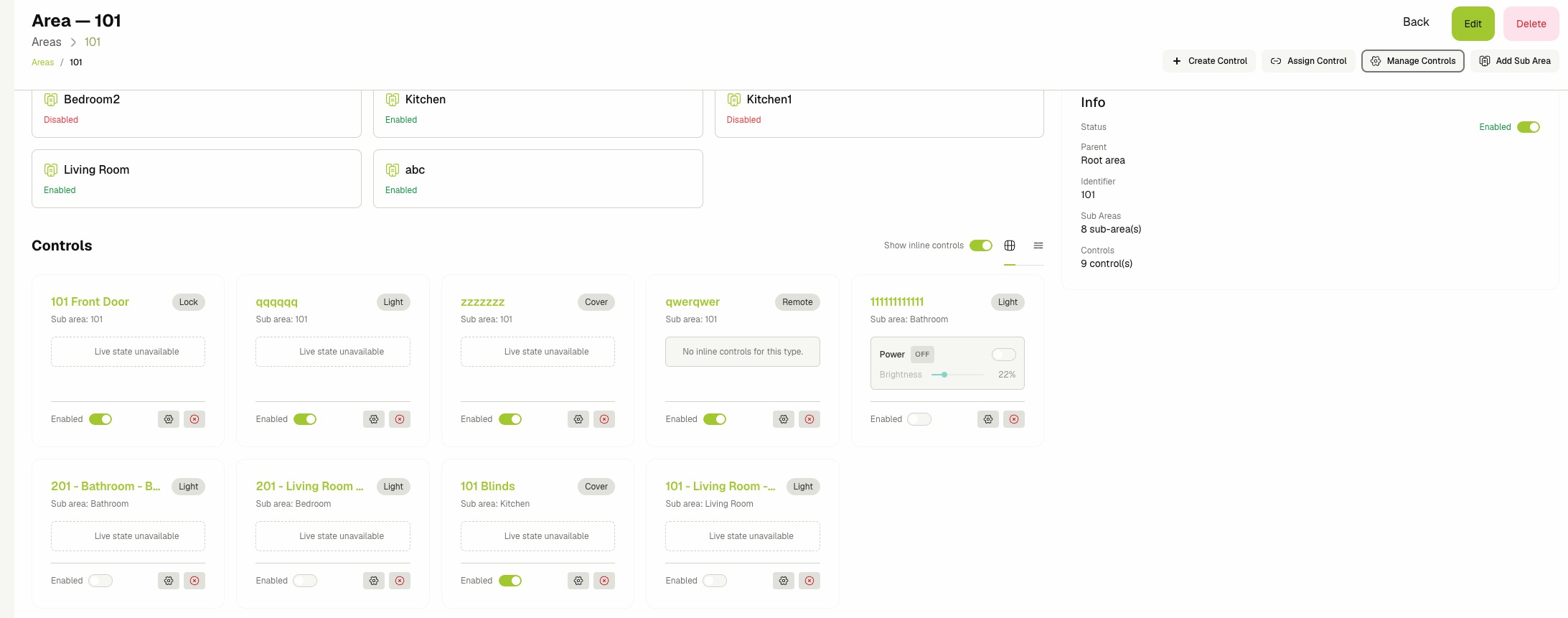
🧭 Viewing Area Details
Opening an area opens its details page. The page is organized around two view tabs and a right-hand info column.
- List View — The default tab. Shows the Sub Areas cards and the Controls assigned directly to this area.
- Tree View — Shows the area and its descendants as a visual tree chart, including the controls placed at each node.
The right-hand column shows:
- Tags — Free-form labels attached to the area. See Managing Tags.
- Info — A summary with the Enabled toggle, parent link, identifier, sub-area count, and control count.
- Preview — When the area has a Base Template, this card shows the merged Display Name and Description per language with badges that indicate whether each field comes from the template (template), is overridden on the area (overridden), or is missing.
You can also navigate the ancestor chain via the breadcrumbs above the page title.
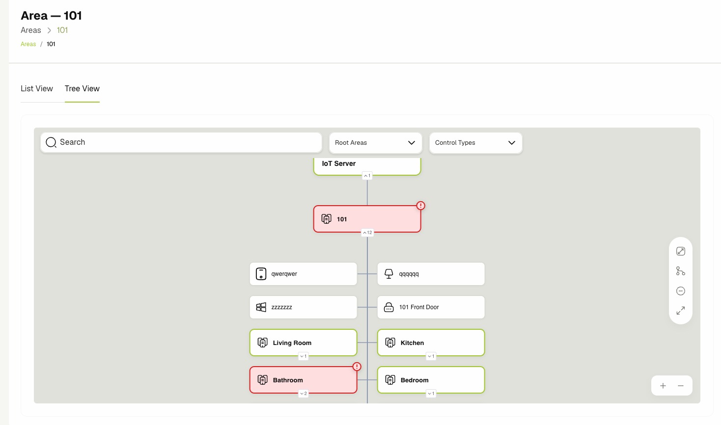
🌳 Using the Tree View
- On the area details page, click the Tree View tab.
- Pan and zoom the chart to inspect the full hierarchy under the current area.
- Hover or click a node to inspect its controls, sub-areas, and template binding.
The tree shows every descendant area together with the controls currently placed inside it, making it easy to see where the layout has gaps before the area goes live.
🎛️ Managing Controls in an Area
The List View tab on the area details page renders the controls that belong directly to this area. Use the Cards view to operate them inline.
- From the area details page (view mode), switch the controls view toggle to Cards.
- Toggle Show inline controls on to render live widgets for each control type (lights, HVAC, covers, locks, toggleables, buttons, scenes).
- Use the embedded widget to operate the device without leaving the area page. Inline widgets display Live state unavailable when the linked entity is not currently reporting.
- Click the gear icon on a card to open the full Control dialog, or click the cross icon to unassign the control from this area.
You can also work with controls through the header actions:
-
Create Control — Opens the new control form pre-scoped to this area.
-
Assign Control — Picks an existing control from the library and assigns it to this area.
-
Manage Controls — Opens the Area Controls dialog. See Managing Area Controls Layout.
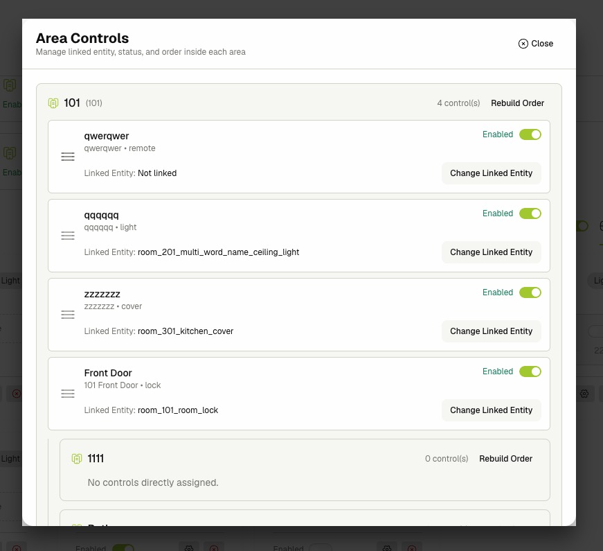
🧩 Managing Area Controls Layout
Use the Area Controls dialog to relink entities, toggle enabled state, and reorder controls across the area and all of its descendants.
- Open the area details page (view mode).
- Click Manage Controls in the header actions.
- Browse the nested layout. Each area section shows the area name, its identifier, the number of controls placed directly inside it, and a list of those controls.
- Drag a control by its handle to reorder it inside its area.
- Click Change Linked Entity on a control to pick a new IoT entity. The picker is pre-filtered to match the control's Type.
- Use the per-row Enabled toggle to enable or disable a control inline.
- Click Rebuild Order on an area section to normalize the order values when reordering becomes inconsistent.
- Click Close to dismiss the dialog.
Reordering and entity linking changes are saved immediately as you drag, toggle, or pick. There is no separate save button.
✏️ Editing an Area
The edit form is the same for root areas and sub-areas; only the Identifier validation differs.
- Open the area details page and click Edit, or click the edit icon on the row in the list view.
- Update any of the following sections:
- Base Template — Pick an existing Area Template to inherit defaults from. Clear it with the close icon to detach the template. See Area Templates.
- Area Information:
- Enabled — Whether the area accepts commands and surfaces in guest UIs.
- Area Name — Required. The display name used in lists and breadcrumbs.
- Identifier — Required for root areas; optional for sub-areas. Must be unique across all root areas because integrations and guest APIs look areas up by this value.
- Localizations — Provide localized Display Name and Description values per language. The English entries become the canonical fallback.
- Metadata — Free-form JSON merged with the linked template's metadata when the area is hydrated. The value must be valid JSON.
- Click Save Area.
- Confirm that the success alert appears and the new values are reflected in the view. When a Base Template is attached, the Preview card on the right updates live as you type.
Localizations and metadata on the area override the values from the linked Base Template. The Preview card on the right shows the merged result with template, overridden, or missing badges so you can verify the inheritance before saving.
🏷️ Managing Tags
- Open the area details page in view mode or edit mode.
- In the Tags card on the right, type a tag name and select it from the suggestions, or press
Enterto create a new one. - Click the remove icon next to a tag to detach it from the area.
🚦 Enabling and Disabling
- Locate the area in the list view or the card view, or open its details page.
- Use the row toggle (list view), the Info card toggle (details page), or the toggle inside Manage Controls to flip the state.
- Confirm that the toggle reflects the new value.
Disabling an area stops it from accepting commands through any of its linked controls and hides it from the guest-facing surfaces. Sub-areas keep their own enabled state and are not toggled by the parent.
🗑️ Deleting an Area
Deleting an area removes it from every dashboard surface and every guest-facing surface. Deleted areas are soft-deleted: they are hidden from lists and cannot be selected as parents, and any controls placed inside them are unassigned. Restore an area only by recreating it.
- Open the area details page.
- Click Delete in the header.
- Review the confirmation message.
- Click Delete to confirm.
- Confirm that the area is removed from the list.
You cannot delete an area that still has direct sub-areas or directly assigned controls. Clear the children first, working from the leaves of the tree upward.
Related Docs
- Area Templates — Reusable defaults that areas inherit through Base Template.
- Controls — Create, assign, and command the user-facing cards placed inside areas.
- Devices & Entities — Manage the integration entities that controls inside areas link to.
- Activity Logs — Audit area create, update, enable, disable, and delete actions.