Controls
🎛️ Controls in the IoT Server Dashboard are the user-facing cards staff and guests use to operate IoT entities such as lights, locks, HVAC units, covers, switches, sensors, buttons, and scenes. Use this page to create controls, link them to integration entities, place them in areas, and send live commands.
📍 Accessing Controls
This page is available to authenticated management users. Creating, editing, and deleting controls is typically performed by Admin and Engineer roles; Operator users can still send live commands from the same page.
- Log in to the IoT Server Dashboard with your management credentials.
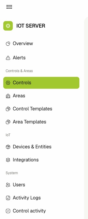
- Inside Controls & Areas section in the left sidebar.
- Click Controls to open the controls list.
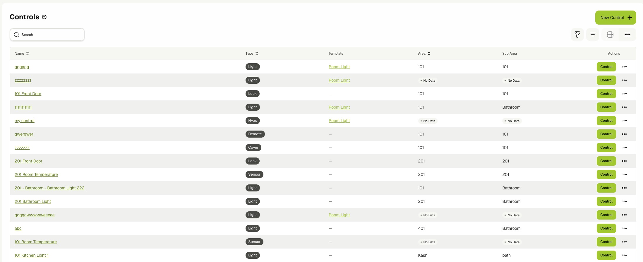
📋 Viewing Controls
The Controls page supports two layouts. Use the view toggle in the toolbar to switch between List and Cards.
The list view shows one row per control with the following columns:
- Name — The control name. Click the name to open the control details page.
- Type — The control type, such as light, lock, hvac, cover, toggleable, sensor, button, scene, or remote.
- Template — The linked control template name. Click the template name to open it in a new tab.
- Area — The root area where the control lives.
- Sub Area — The nested area path under the root, when applicable.
- Created At — Hidden by default. Enable it from the column settings to display the row creation timestamp.
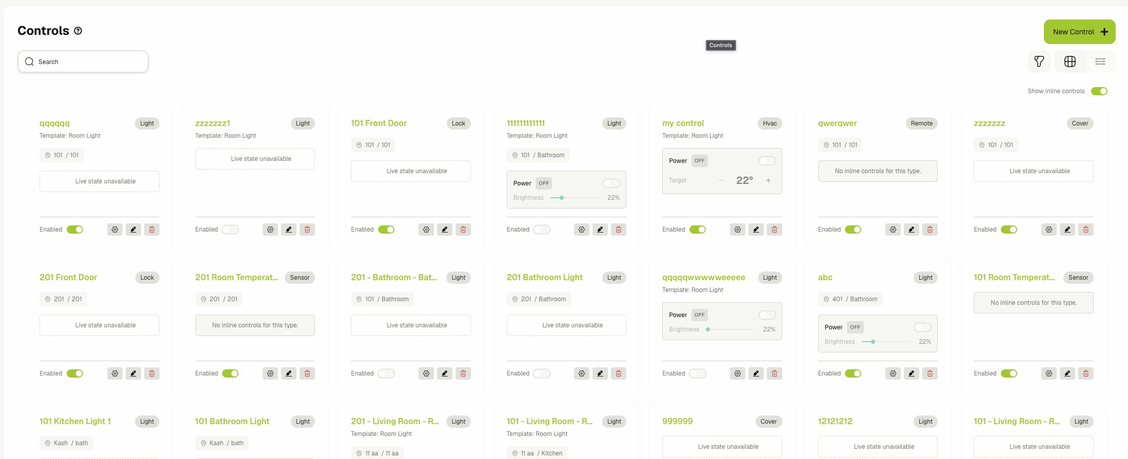
The card view shows the same controls as tiles. Each card includes the name, type tag, area path, and an action row with the Enabled toggle and quick-edit buttons.
🟢 Showing Inline Controls in Card View
The card view supports embedded live widgets so you can command devices without opening the Control dialog.
- Switch the view toggle to Cards.
- Toggle Show inline controls on above the grid.
- Use the embedded widget on each card to operate the device:
- Light — adjust on/off, brightness, color, and color temperature when available.
- HVAC — set mode, target temperature, and fan speed.
- Cover — open, close, and slide position.
- Lock — lock or unlock the entity.
- Toggleable — flip the power state.
- Button — press to trigger the bound action.
- Scene — activate the scene.
- Toggle Show inline controls off to hide the inline widgets and free space on the cards.
Inline widgets display Live state unavailable when the linked entity is not currently reporting.
🔍 Searching, Filtering, and Pagination
- Enter text in the Search field to narrow the list by control name.
- Open the Type filter to limit the list to one or more control types.
- Open the Area filter to limit the list to controls in selected areas. The filter loads candidate areas as you type.
- Click Clear filters to reset all selected filters. Your selections are remembered per browser.
- Use the column sort arrows on Name, Type, Area, or Created At to sort the list.
- Use the pagination controls to move between pages and to change the rows-per-page value (10, 25, 50, or 100).
➕ Creating a Control
- Click New Control on the list toolbar.
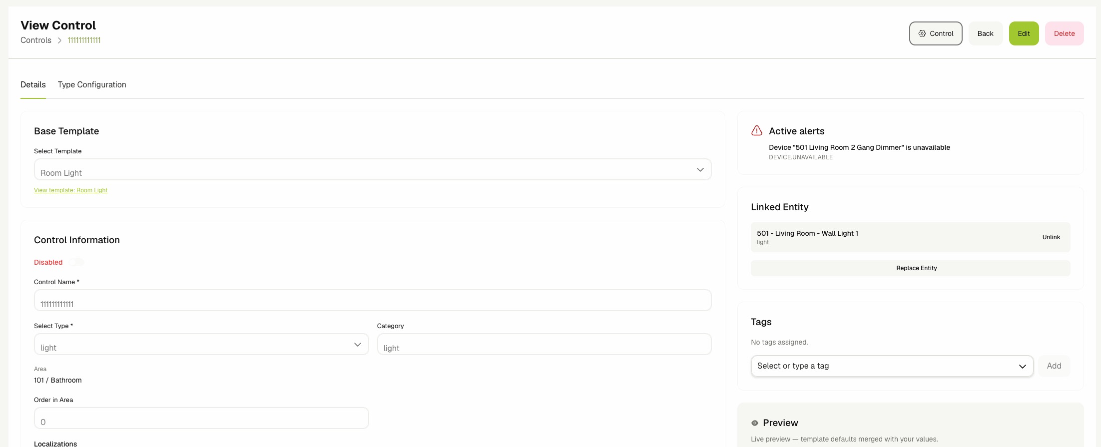
- On the Details tab, fill in the following required fields:
- Base Template — (Optional) Select an existing Control Template to inherit defaults from. Selecting a template auto-fills the Type when it is empty. See Control Templates.
- Control Name — A unique, human-readable name shown in lists and audit trails.
- Select Type — One of light, lock, hvac, cover, toggleable, sensor, button, scene, or remote.
- Category — (Optional) Free-form grouping label that overrides the template category.
- Area — Click Pick Area to open the Select Area tree and choose where the control appears. Click Clear to remove the area assignment.
- Order in Area — (Optional) Numeric position used to sort controls inside the chosen area.
- Localizations — Provide localized Display Name and Description values per language. The English entries become the canonical fallback.
- (Optional) Open the Metadata card and enter valid JSON in the JSON Metadata field.
- (Optional) Open the Type Configuration tab to constrain or tune the chosen type. The available fields depend on the selected Type:
- Light — Min brightness and Max brightness (0–255). Toggle Disable color picking and Disable color temperature when the linked light should not expose those features.
- HVAC — Min temperature, Max temperature, Allowed modes (off, heat, cool, fan, auto, dry), and Allowed fan speeds (auto, low, medium, high).
- Cover — Min position and Max position (0–100). Toggle Flip open/close direction when the physical cover moves opposite to the dashboard slider.
- Lock — Behavior: Switch (lock / unlock) for stateful locks, Momentary unlock for relay-style locks that re-lock automatically.
- Other types (toggleable, sensor, button, scene, remote) currently have no type-specific configuration.
- Click Create Control.
- The new control opens in view mode. Use the Linked Entity card on the right to attach the integration entity that will receive commands (see below).
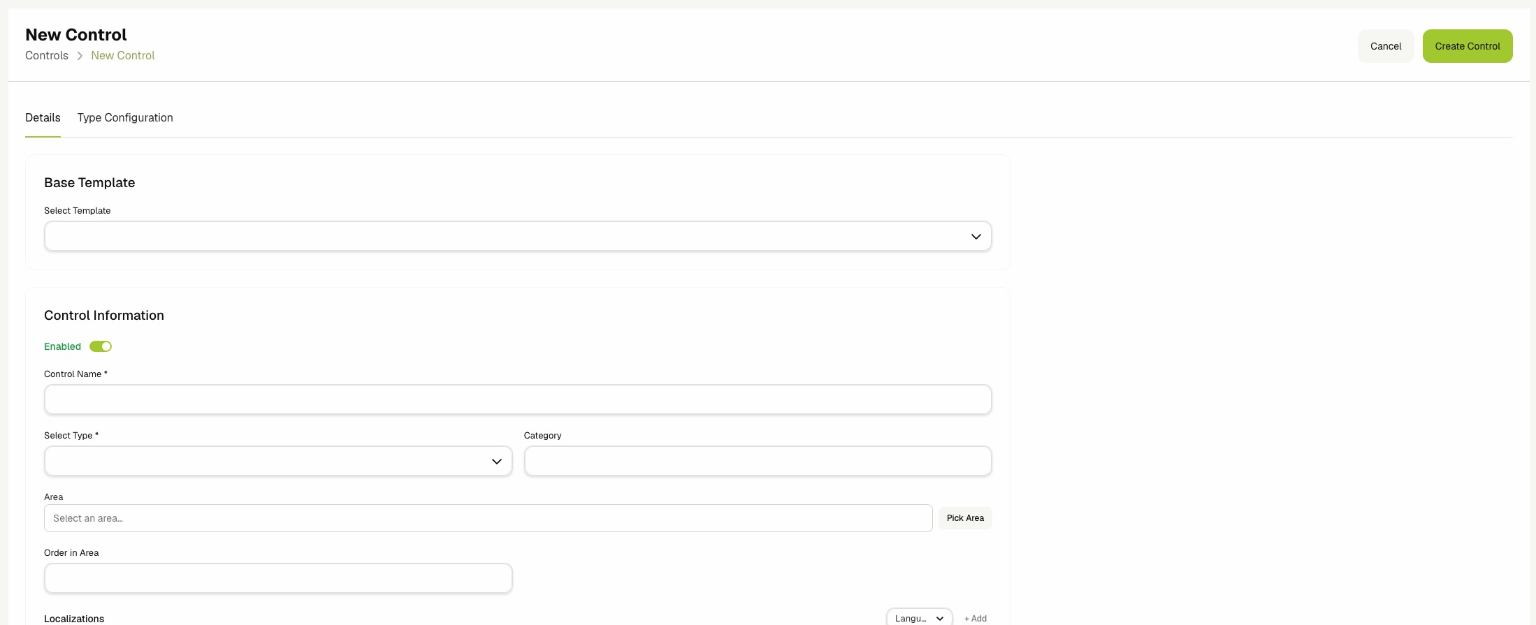
When several controls share the same display name, description, category, or metadata, create a Control Template first and select it under Base Template. The control then only needs to store its area assignment and any field overrides.
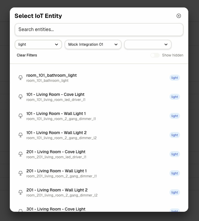
🔗 Linking an Entity
A control routes commands to a single linked IoT entity.
- Open the control in view mode.
- In the Linked Entity card on the right, click Link Entity or Replace Entity.
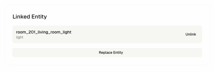
- Pick the entity from the IoT Entity Picker dialog. The picker is pre-filtered to match the control's Type.
- Confirm that the linked entity appears in the card with its name and type.
- To swap the linked entity, click Replace Entity and select a new candidate. The old link is removed and the new one is created.
- To remove the link entirely, click Unlink.
Each control links to one entity. Replacing an entity unlinks the previous one and links the new one in a single step.
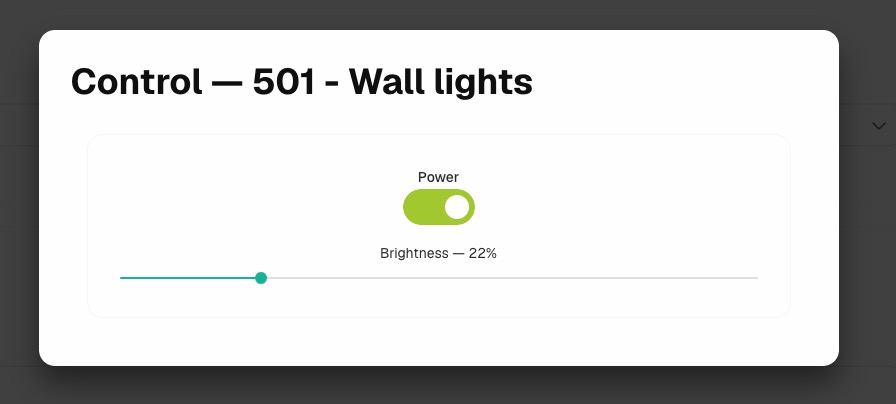
🎛️ Commanding a Control
Use the Control dialog to send live commands and observe real-time state.
-
From the list view, click Control on the row, or open the control details page and click Control in the header.
-
Wait for the dialog to report Connecting to live state…. Once connected, the dialog renders the live command surface for the control's Type.
-
Use the available widgets to operate the device (brightness slider, HVAC mode picker, cover position, lock toggle, scene activator, and so on).
-
Close the dialog to stop the live state subscription.
Each command sent through this dialog is recorded on the Control activity page. See Control Activity.
🏷️ Managing Tags
- Open the control in view mode or edit mode.
- In the Tags card on the right, type a tag name and select it from the suggestions, or press
Enterto create a new one. - Click the remove icon next to a tag to detach it from the control.
🚦 Enabling and Disabling
- Locate the control in the list view or the card view.
- Use the row toggle (list view) or the Enabled toggle on the card (card view) to flip the state.
- Confirm that the toggle reflects the new value.
Disabling a control stops it from accepting commands through the dashboard, the Control dialog, and guest-facing surfaces. Re-enable it to restore command flow without changing any linked entity or template settings.
✏️ Editing a Control
- Open the control details page and click Edit, or click Edit on the row in the list view.
- Update any fields on the Details tab or the Type Configuration tab.
- Click Save Control.
- Confirm that the success alert appears and the new values are reflected in the view.
🗑️ Deleting a Control
Deleting a control removes it from every dashboard surface, every guest-facing surface, and every area layout. The linked integration entity is preserved and can be linked to a new control.
- Open the control details page or locate the control in the list.
- Click Delete in the header, or click Delete on the row.
- Review the confirmation message.
- Click Delete to confirm.
- Confirm that the control is removed from the list.
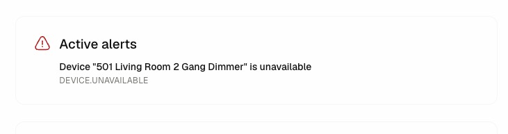
🚨 Active Alerts
When a control has open runtime alerts, the view mode shows an Active alerts panel on the right with the alert title and type for each unmuted entry.
- warning — non-critical issue that does not block commands.
- error — command path is impaired; investigation recommended.
- critical — the control is effectively unusable until the alert is cleared.
Use the Alerts page to review, mute, and clear these entries.
Related Docs
- Control Templates — Reusable defaults that controls inherit through Base Template.
- Devices & Entities — Manage the integration entities that controls link to.
- Integrations — Connect the external platforms that report entities.
- Control Activity — Audit every command sent through controls.
- Activity Logs — Audit dashboard management actions on controls, templates, and links.
- Areas — Organize where controls appear in the dashboard and guest-facing UI.